UPDATE: As of July 2020, I have updated the data analysis tool to use some cool newer JavaScript libraries. My graphing library is Chart.js (it has some fancy animation options and allows copy/pasting of generated graphs) and Handsontable (which uses an excel-like grid for inputting data, which also allows copy/pasting from excel or other spreadsheet programs).
In Modeling Instruction and Advanced Placement science courses, students must be able to analyze data to determine the relationship between two variables. To make this easier, I created a Data Analysis Tool.
I’ve tried a few ways for students to graph data:
| Method | Pros | Cons |
| Graph Paper | * Requires a firm grasp of scales, slope, and y-intercept * Students gain a better grasp of the meaning of these quantities and where they come from * Flexible — few limitations * No technology quirks to learn | * Time-consuming * Requires multiple iterations to linearize non-linear relationships * Difficult to test several analysis methods to determine the best fit * Best-fit lines, slopes, and y-intercepts are not as accurate |
| TI-84 Calculator | * Can be used on the AP Exam & ACT! * Manual window-setting requires students to consider how they will view their data * Students can create their own best-fit line by writing a linear equation in Y1 * OR, it has LinReg capabilities * A bit quicker than graphing by hand | * Data entry, turning stat-plots on, and graphing is not as intuitive as it could/should be * Regressions are also not very intuitive, and getting the linear fit to display on the graph is another hurdle * Doesn’t handle units at all — that’s up to the student * No easy way to get a printout of the graph for inclusion in reports * Not all students have this calculator (it’s expensive) |
| Vernier LoggerPro | * Quick * Takes care of units, labels, and titles * Easily adjust what is graphed on each axis * Support for force, motion, and other sensors * Linear fit is available with 1 button click * Supports graphing multiple data sets, a secondary y-axis scale, and many advanced features | * Linearizing with calculated columns is somewhat cumbersome; requires quite a few steps * For novices, the large number of features make it difficult to remember the correct steps to get the desired results * Not likely to use this software in other contexts * Not widely available (though the site license is generous) |
| Microsoft Excel or Google Sheets | * Powerful and flexible * Supports graphing multiple data sets, secondary y-axis scale, and many advanced features * Likely to be used in college, industry, etc. * Widely available (and for Google Sheets, free) | * Need to set up own data table * New versions of Excel do not label axes by default * Google Sheets graphs lack some features and are not the most intuitive (though I haven’t used them in a couple years so perhaps they’ve improved) * Again, the huge number of features often make it hard to find the desired functions |
To start the year, I always have students graph data using graph paper for a couple weeks. I think students need to be able to do it themselves and understand the basic considerations of choosing scales, deciding what to plot where, and finding slopes and y-intercepts manually before having a device/computer do it for them.
In the past, after students got more comfortable graphing things by hand, I showed them how to use some tools (in the past, this tool has been LoggerPro). But, after having to guide students through the LoggerPro linearization process time and time again for each lab, I wanted to find a better solution. My current version works pretty well, but I’d welcome your feedback. I also have a version with linearization tools hidden.
Version 1.0
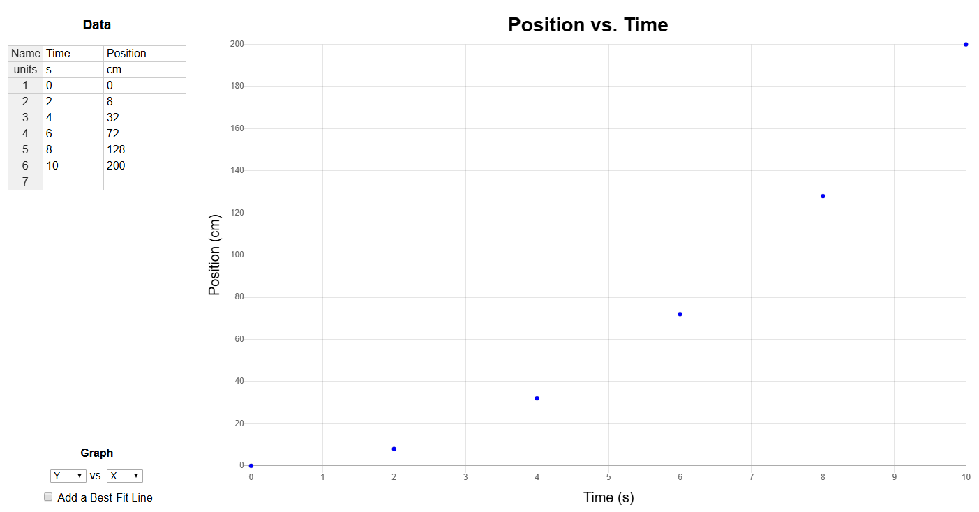
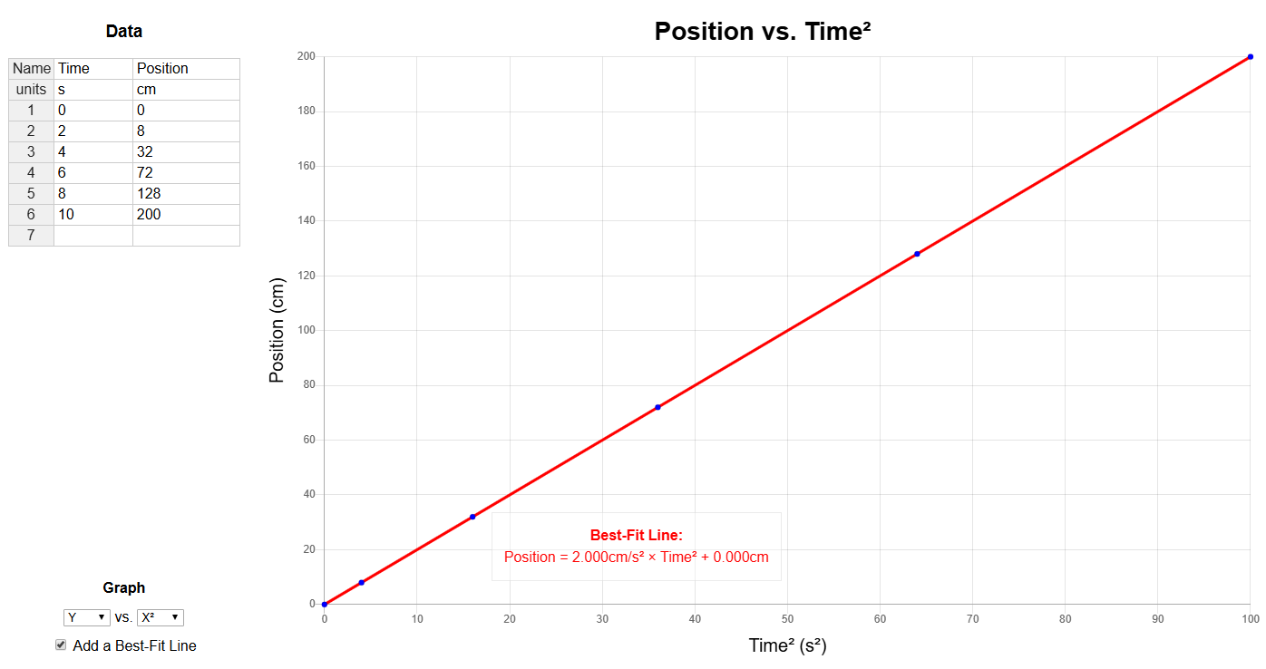
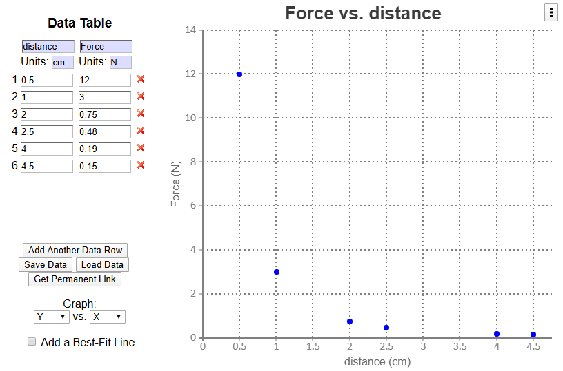
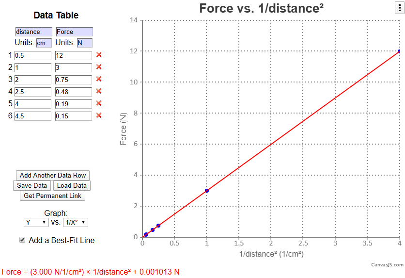
In June of 2016, I wrote a quick online data analysis tool (using the graphing capabilities of CanvasJS). Check it out here. It does most of what I need it to, which is to take a set of data, graph it, allow students to linearize it (graph y vs. x2, y vs. 1/x, etc.), and output the best-fit line equation.
I also created a version with the linearization capabilities hidden (to require students to do this manually).
Improvements I may try to implement in the future:
- Data input improvements (arrow keys for navigating) – implemented though still has some quirks
- Improve linearization interface somehow – still thinking about this
- Display the squared, cubed, or inverse of a column in the data table (?)
- Graph multiple data sets simultaneously
[…] Data Analysis Tool […]