In our Human Body Systems course, students learn about the digestive system and enzymes that help break down various food macromolecules. As a bonus, most of my HBS students are also taking chemistry, so we have opportunity to share ideas across the disciplines.
In the past, we did a hands-on lab measuring the rate of reaction of catalase to break down hydrogen peroxide. We could vary the temperature, pH, agitation, concentration, or a number of other independent variables to determine their effect on the efficacy of the catalase enzyme. While I love doing hands-on labs with students, this one took several days to collect enough data, and the data we collected was often unreliable–students measured reaction rates using gas pressure sensors. Any leaks in the flasks, stoppers, or hoses would give us bad data, and then using the computer interface to find the slope of the pressure increase (our proxy for reaction rate) was a small hurdle as well.
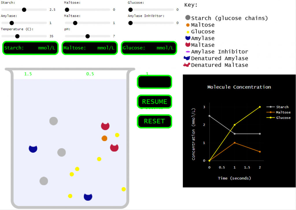
A couple years ago, my class was running behind and I decided to forego the hands-on portion, but I still needed students to learn the effects of various conditions on enzymes. So, I found a great enzyme simulation at Biology Simulations. Very cool! I love how the collisions between molecules are clearly shown and how we can change so many variables to test their effect on the reaction.
However, for my purposes, this simulation incorporated a bit too much. There are multiple enzymes. There are multiple reactants and products. There are inhibitors! SO many things to play around with. Which is all good, but I needed my students to understand the basics. How do things like pH, temperature, and concentration affect an enzyme…
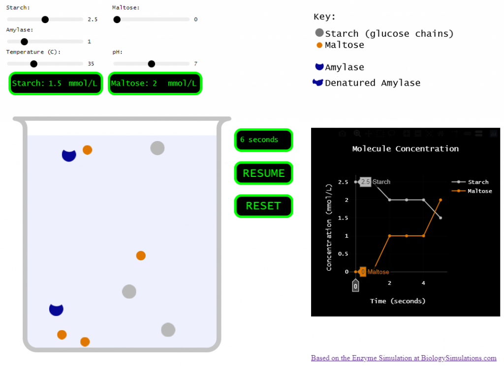
So, I set out to pare the biology simulations version down to just a few variables and a single enzyme.
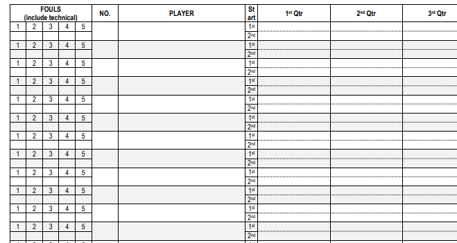
For many years, I’ve used the NCAA basketball scorebook for my Jr. High and High School teams, and it’s worked great. However, for the 2023-2024 season, the NFHS changed the rules on tracking team fouls. Teams shoot bonus free throws on the fifth (and subsequent) team foul in each quarter (it used to be after the seventh and tenth foul in each half, but no longer!).
Since the NCAA scorebook only has a place to track team fouls by half, I created my own scorebook that has space to track team fouls by quarter. Check it out, and leave any feedback. I also included an editable Word document below that can be modified to your liking!
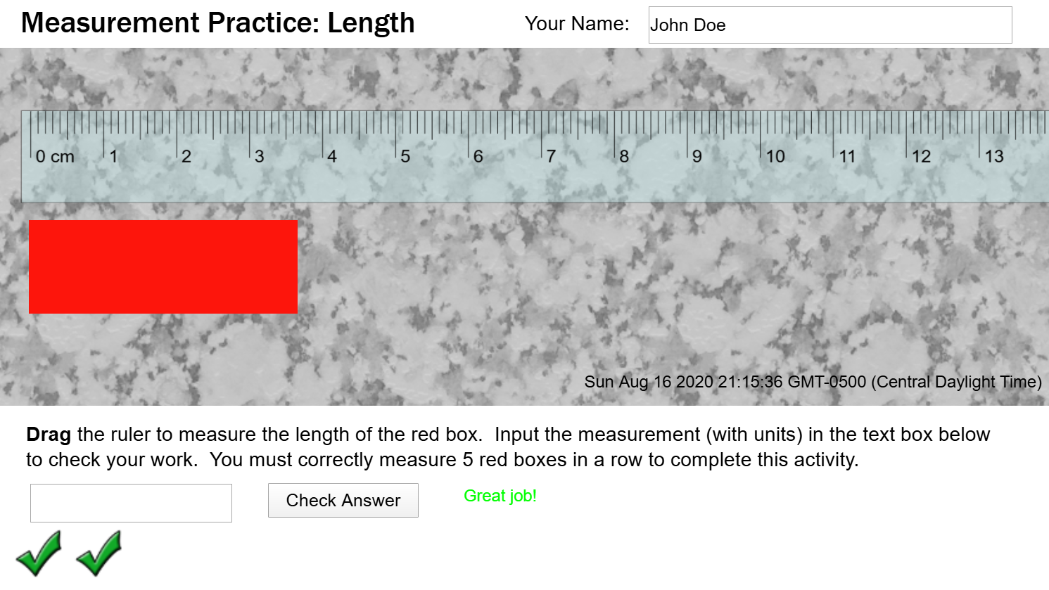
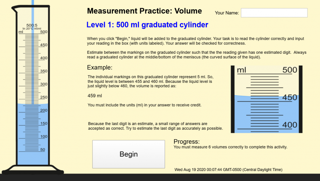
As we begin the school year in the wake of Covid-19, traditional labs and hands-on activities are very limited. Therefore, we need to find ways to do things virtually. I developed this interactive measurement & scale-reading activity using Construct 3. Students can use this to practice reading the scale on a ruler and reading the volume in three different-sized graduated cylinders.
Length Measurement Features
Draggable ruler
Checks accuracy of measurement and provides feedback.
Accepts measurements within ±0.015 cm of the actual length.
Provides encouragement to estimate as accurately as possible for measurements within ±0.03 cm of the actual length.
Requires input of units (cm) for each measurement.
Challenges users to measure five lengths in a row. Any mistakes will cause the count to start over.
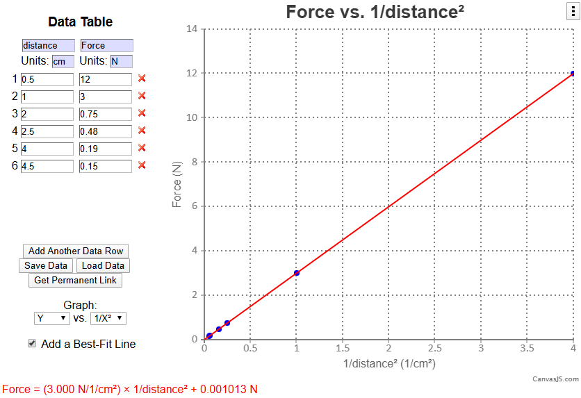
UPDATE: As of July 2020, I have updated the data analysis tool to use some cool newer JavaScript libraries. My graphing library is Chart.js (it has some fancy animation options and allows copy/pasting of generated graphs) and Handsontable (which uses an excel-like grid for inputting data, which also allows copy/pasting from excel or other spreadsheet programs).
Updated Data Analysis tool.
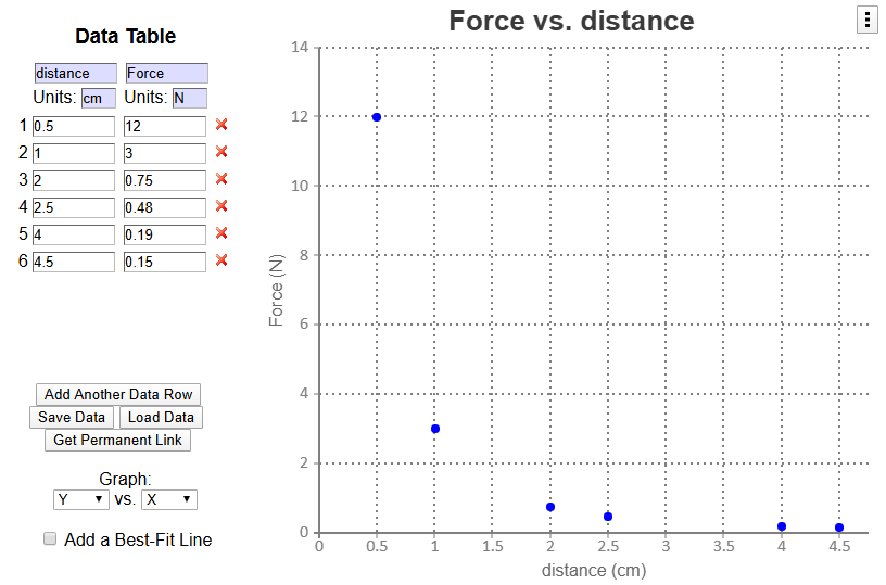
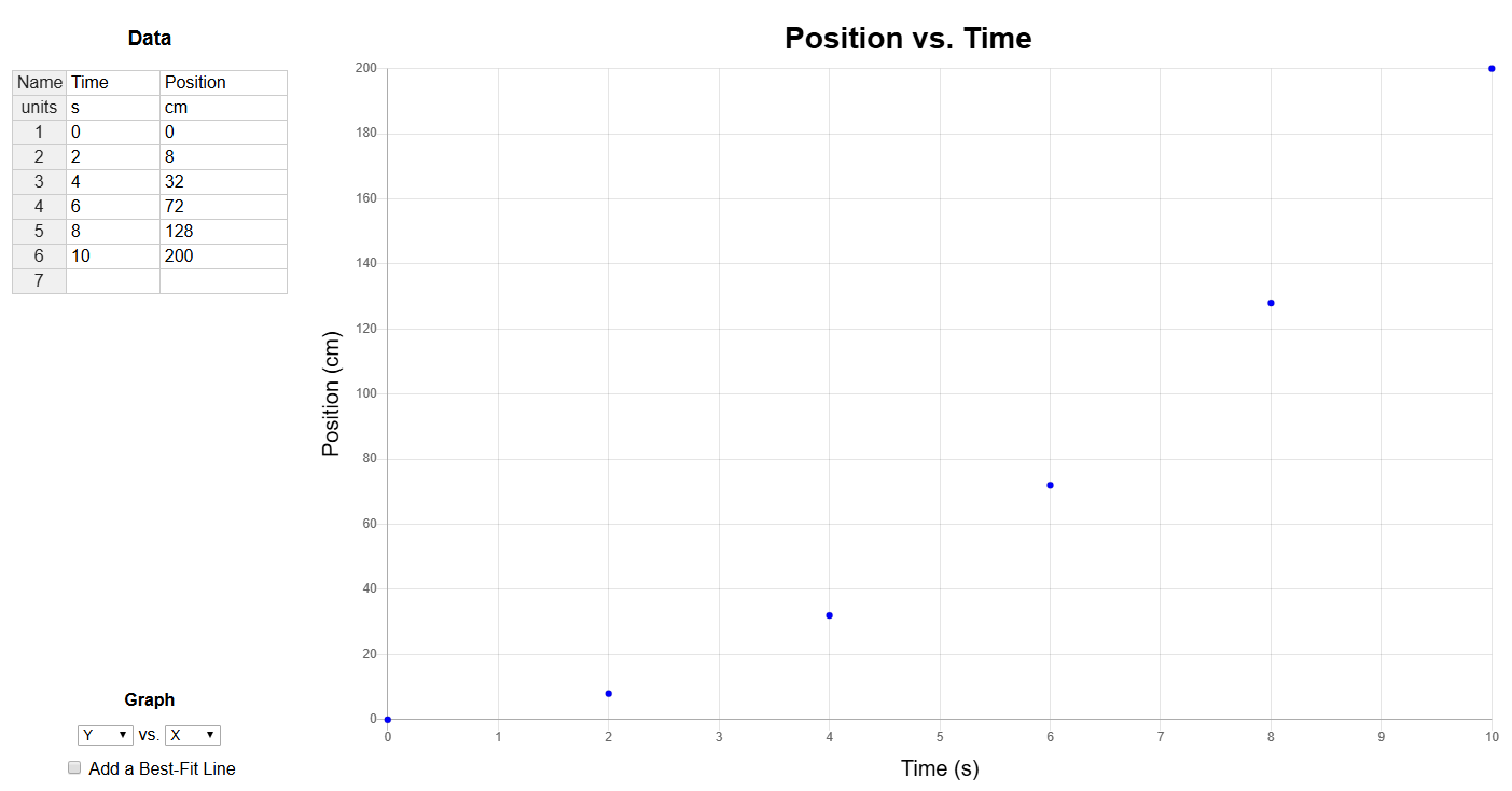
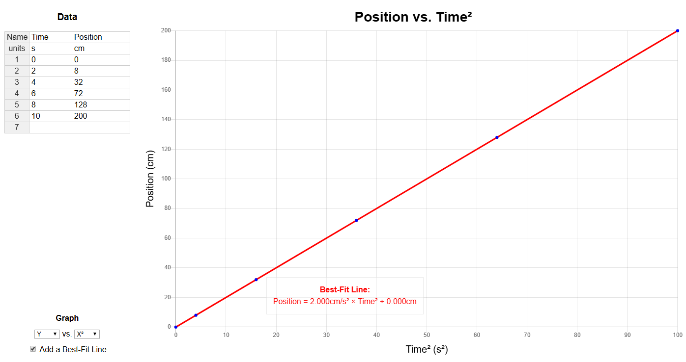
In Modeling Instruction and Advanced Placement science courses, students must be able to analyze data to determine the relationship between two variables. To make this easier, I created a Data Analysis Tool.
I’ve tried a few ways for students to graph data:
Method
Pros
Cons
Graph Paper
* Requires a firm grasp of scales, slope, and y-intercept * Students gain a better grasp of the meaning of these quantities and where they come from * Flexible — few limitations * No technology quirks to learn
* Time-consuming * Requires multiple iterations to linearize non-linear relationships * Difficult to test several analysis methods to determine the best fit * Best-fit lines, slopes, and y-intercepts are not as accurate
TI-84 Calculator
* Can be used on the AP Exam & ACT! * Manual window-setting requires students to consider how they will view their data * Students can create their own best-fit line by writing a linear equation in Y1 * OR, it has LinReg capabilities * A bit quicker than graphing by hand
* Data entry, turning stat-plots on, and graphing is not as intuitive as it could/should be * Regressions are also not very intuitive, and getting the linear fit to display on the graph is another hurdle * Doesn’t handle units at all — that’s up to the student * No easy way to get a printout of the graph for inclusion in reports * Not all students have this calculator (it’s expensive)
Vernier LoggerPro
* Quick * Takes care of units, labels, and titles * Easily adjust what is graphed on each axis * Support for force, motion, and other sensors * Linear fit is available with 1 button click * Supports graphing multiple data sets, a secondary y-axis scale, and many advanced features
* Linearizing with calculated columns is somewhat cumbersome; requires quite a few steps * For novices, the large number of features make it difficult to remember the correct steps to get the desired results * Not likely to use this software in other contexts * Not widely available (though the site license is generous)
Microsoft Excel or Google Sheets
* Powerful and flexible * Supports graphing multiple data sets, secondary y-axis scale, and many advanced features * Likely to be used in college, industry, etc. * Widely available (and for Google Sheets, free)
* Need to set up own data table * New versions of Excel do not label axes by default * Google Sheets graphs lack some features and are not the most intuitive (though I haven’t used them in a couple years so perhaps they’ve improved) * Again, the huge number of features often make it hard to find the desired functions
To start the year, I always have students graph data using graph paper for a couple weeks. I think students need to be able to do it themselves and understand the basic considerations of choosing scales, deciding what to plot where, and finding slopes and y-intercepts manually before having a device/computer do it for them.
In the past, after students got more comfortable graphing things by hand, I showed them how to use some tools (in the past, this tool has been LoggerPro). But, after having to guide students through the LoggerPro linearization process time and time again for each lab, I wanted to find a better solution. My current version works pretty well, but I’d welcome your feedback. I also have a version with linearization tools hidden.
Version 1.0
In June of 2016, I wrote a quick online data analysis tool (using the graphing capabilities of CanvasJS). Check it out here. It does most of what I need it to, which is to take a set of data, graph it, allow students to linearize it (graph y vs. x2, y vs. 1/x, etc.), and output the best-fit line equation.
Unit 1 of the Modeling Instruction chemistry curriculum has students develop the ideas of mass and volume and then the relationship between them (density). Consistent with the Modeling Instruction method, students collect data and analyze that data to develop a model to describe a relationship.
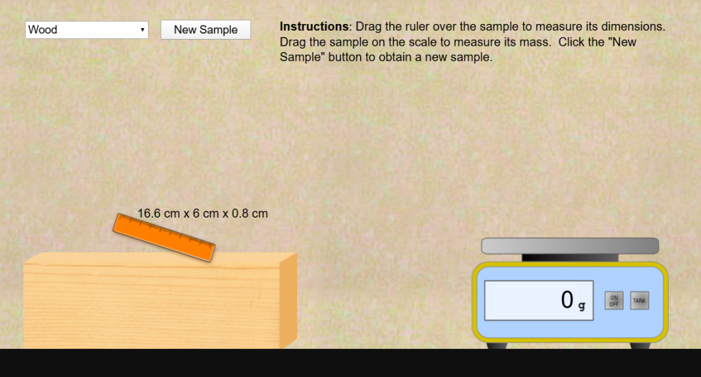
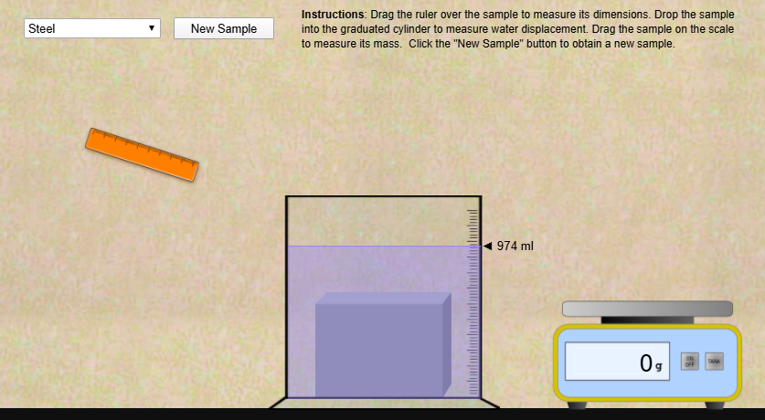
This year, my school is beginning virtually. It will be a challenge to transform our chemistry lab activities to the online format until we are able to resume in-person classes (and even then, we will be limited in the types of activities that we can do while “socially distant”). As I thought about facilitating my class online, I discovered Construct.net, which is typically used to produce online games. I found that it can be adapted to simulate labs like this one. I created a couple different versions. Check them out!
Dimensional Measurement VersionWater Displacement version
It simply allows students to measure the mass and volume of several samples of a material (currently, it has steel, aluminum, and wood). The first sample is always the same size for everybody, but subsequent samples are random sizes/masses (so encourage students to include a wide range of sample sizes in their data). Students can then use whatever graphing tools desired to analyze the data. A few years ago, I made a simple data analysis tool that would work well for this.
I like that the water displacement version shows which substances sink and float. Also, you can produce some samples that, because of their size or density (wood) do not completely submerge. This provides a chance to discuss what the water displacement measurement represents.
The water displacement version can also be used to show the relationship between cm3 and ml.
Just measure a sample with the ruler and then dunk it in the water.
Leave a comment about any issues you find or requests for features. Here are some things I’m thinking about:
More realistic interactions: an on-screen ruler to measure length, width, and height would build measurement skills. But, Contruct.net is really a 2-dimensional tool, so measuring that third dimension would be a challenge.
I had a request for cylindrical samples to better match the materials many of us use for the actual lab activity. It’s an idea for the future, especially if this is used to supplement the in-person activity for those who are absent.
UPDATE July 27, 2020:
Added zinc, copper, and lead to the substances.
Changed the button text to say “New Size”
Clarified the instructions.
The source files are available for anyone wanting to modify or extend. This was my first time using Construct.net, so keep that in mind before you berate me for my shoddy work 🙂. I do encourage anyone else working on this or similar lab simulations to share what you come up with.
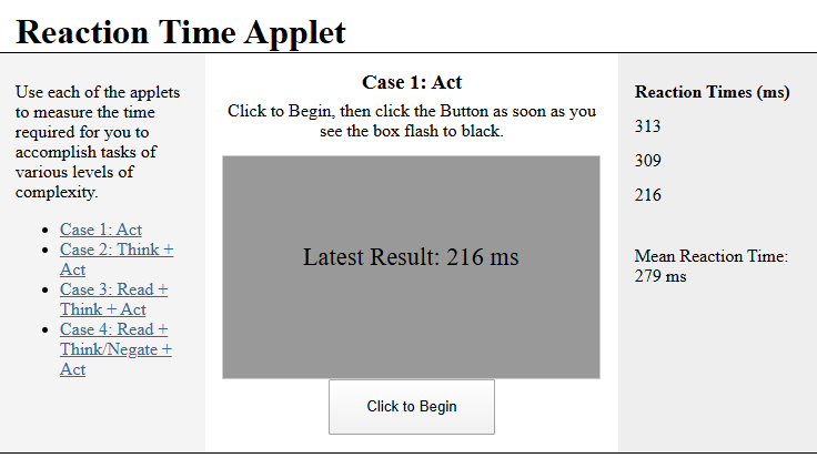
During our PLTW Human Body Systems lesson on the nervous system, we study the speed at which signals travel through neurons, as well as the regions of the brain that control various functions. The curriculum points us to a cool little activity that measures our reaction time when doing tasks of increasing complexity. In Case 4, it becomes quite challenging to have to read a set of instructions and do the opposite as quickly as possible.
The applet used by PLTW is a Shockwave applet by Serendip, but Shockwave hasn’t been well-supported in a long time, and now that my students use Chromebooks, it definitely won’t work. It now appears that the shockwave app has been removed, and the PLTW curriculum now uses a much more basic reaction time app.
So, I set out to recreate this great applet in a more portable and cross-platform language (HTML and JavaScript). The functionality is similar. My attempt is definitely not as refined as the original, but it gets the job done. Also, students are responsible for recording their own times, because my version discards all times when changing between parts of the activity.
In AP Physics 1, students need to learn about the relationship between wave frequency and wavelength (wave speed). If students are going to investigate this relationship and collect data for analysis themselves, there are a couple options:
Snaky springs – ($13.50/ea from Amazon and comes with slinky and rope, $17/ea from Arbor Sci, $18/ea from PASCO) – Students can set up standing waves in the spring, then measure frequency and wavelength. It’s very tactile and when it works, it works well — data is reliable. It is difficult to get a feel for how to oscillate at the correct frequency for the standing waves (and some groups weren’t really successful doing so in the time we had). Only allows for 4 or 5 harmonics before it becomes very difficult to introduce such high-frequency oscillations.
Computer Simulation – PhET – Allows adjustment of amplitude, frequency, end type, damping, etc. and measurement of wavelength. A fine option, though not as tactile. I use it for students to investigate wave reflections, but have not used it for wavelenth & frequency. I would prefer a real-world, more tactile method if possible — I question whether students always make the connection to real-world situations when their primary experience is a computer simulation.
Wave drivers – (Vernier: $115, but also need a power amplifier, $199; PASCO: $249, but also need a function generator, $259+; CPO $400, there are probably other systems available, but they all seem to be very expensive) – allows students to adjust the frequency of vibrations in a string until a standing wave is set up, then measure wavelength. Using this method, students are very interested and engaged, and they get to see a real-world physics phenomenon. The data produced is very reliable. But this would be a very expensive set-up to provide for 6 lab groups.
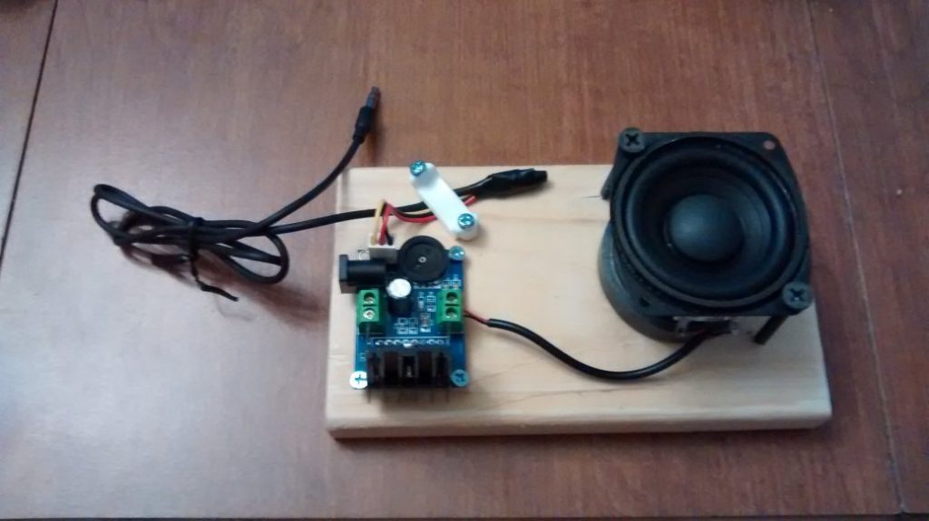
I set out to see if I could make my own wave driver for less $$$.
Speaker Version
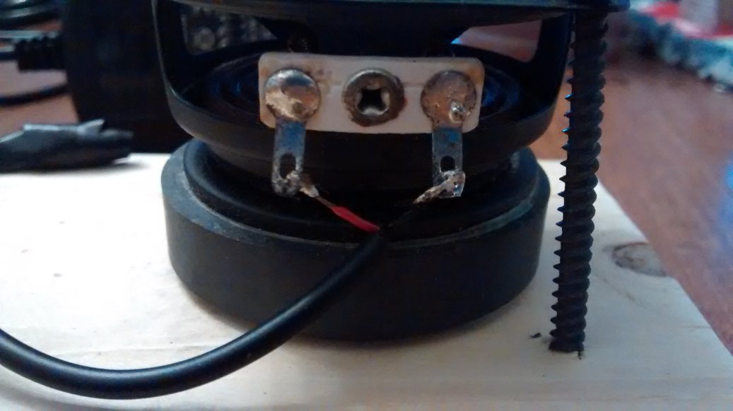
For my first iteration, I used some Logitech computer speakers ($20 on Amazon). Essentially, I removed the grille covering the speaker and hot-glued a bent paper clip to the speaker cone, that allows the speaker to drive a string.
I tie the string to a solid object on one end (ring stand) and run it across a table and off the end over a pulley. Then, hang a weight off the pulley end of the string to introduce a known tension.
Diagram of the speaker version of the apparatus
I connect the speaker system to a laptop, have students go to an online function generator (like this one, though there are many available), and adjust the frequency until a standing wave is set up. Then they measure the wavelength and record the frequency/wavelength pair.
By graphing wavelength vs. frequency, students can determine that an inverse relationship exists, which they can then linearize (possibly by using my data analysis tool). The slope then comes out to be a speed, which we determine to be the wave speed in the string.
The speaker works wonderfully. The wave amplitude isn’t great, but the standing waves are clearly visible.
I also tried this with a cheaper speaker system, but the speaker cone barely moved, so it didn’t produce visible standing waves in the string. You need a speaker for which the cone moves with a decent amplitude to drive the waves in the string.
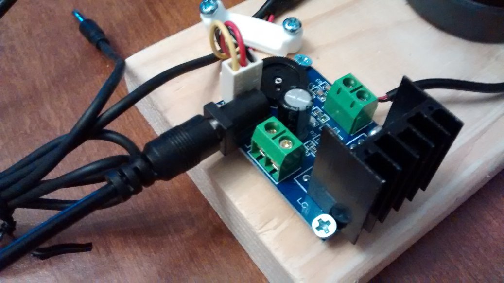
Homemade Wave Driver
I wanted to see if I could further cut down on the cost. I obtained the following supplies:
Description
Source
Cost/each
TDA7297 Audio Power Amplifier *(There are many similar versions available. Try to find one with a 5.5 mm OD barrel/coaxial power plug and a 3.5mm aux audio connector. The one I bought had a 3-pin audio connector, so I had to buy some of those and solder it to a 3.5mm aux cord. You only need a single channel or just use 1 of a 2-channel amplifier)
DC 12V AC Adapter *(You may be able to find them more cheaply – just need a 5.5 mm OD / 2.1 mm ID plug. I went with a 2-amp output to ensure enough power, but probably 1A is enough.)
2″ or 3″ speaker A Logitech 3W 4-ohm speaker worked ok. A 50W car speaker worked ok also, but I’ll probably need to use a heavier string. Around a 10W speaker seems to be ideal.
Screws – I have an assortment, but here’s what I used (3) tiny screws to attach PCB amplifier board to wood board (2) 2″ drywall screws (or similar) to attach speaker to board (?) I also screwed down the audio cable with a piece of plastic to keep it from being accidentally pulled off and damaging stuff.
1×4 mounting board (about 6″ long) – From scraps
Total
$12.50 – $15.50
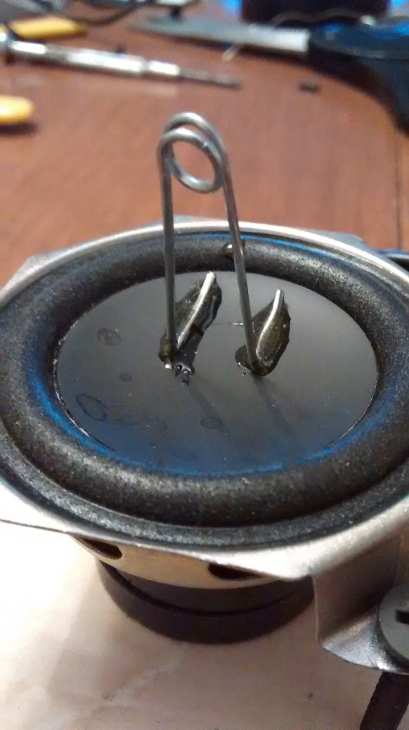
The initial prototype works great.
Prototype. Just needs power to the barrel connector on the PCB and a bent paperclip glued to the speaker cone to interface with the string to produce standing waves.
Assembly:
Cut a piece of 1×4 board in about 6 inch long pieces to serve as a base.
Use 3 tiny screws to secure the amplifier PCB to the 1×4. Arrange it so the power connector hangs off one side of the board.
Cut a 3.5mm aux cord in half. Strip the insulation from the end you cut. There are 2 wires inside that carry the left and right channel signal (carefully strip about 1/4″ of insulation from these as well), and bare wires which are neutral. Of course, not all cables are made the same way, so yours may be different.
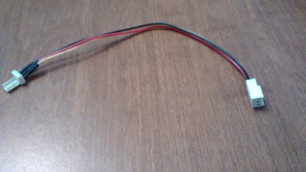
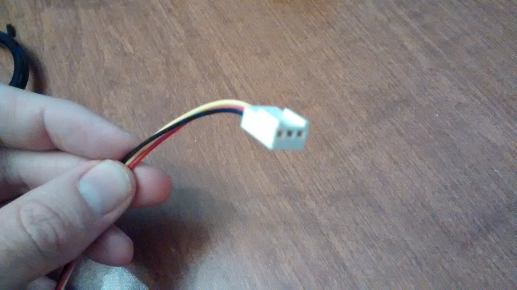
Cut a fan extension cable in half so you have the female pin end (shown). Strip the ends you cut.
Twist together the black fan connector wire with the neutral aux cord wire. Similarly, connect the red fan connector wire with one channel from the aux cord. And the yellow fan connector wire with the other channel from the aux cord. Solder these connections, then cover each one with heat-shrink tubing (or easier: electrical tape). Sorry, I forgot to take a picture of this…
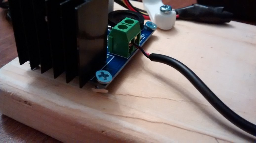
Plug the female pin connector into the amplifier board. I also used an electrical cord staple, removed the nails, and screwed it down on top of the aux cord wires to hopefully prevent some jerk from jerking the cord and destroying my wave driver.
Run a wire from the amplifier output (+) to one terminal on the speaker.
Run another wire from the amplifier output (-) to the other terminal of the speaker. (Doesn’t matter which is which)
Tighten the screw-connectors on the amplifier output terminals.
Solder these other ends on the wires to the speaker.
Use the 2″ screws to attach the speaker to the 1×4. Depending on the size of your speakers, you may need longer/shorter screws.
Bend a paper clip and hot glue or epoxy it to the speaker cone as shown: The cord or string being driven sits in the loop on the paper clip.
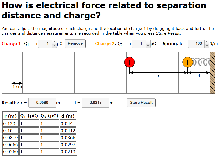
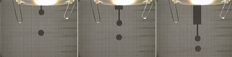
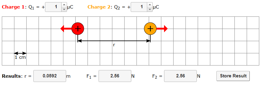
In the Modeling Instruction materials for Physics: E&M, there are videos provided that can be analyzed to develop quantitative relationships between electrostatic force, separation distance, and charge quantity. However, this process is rather complex and requires using distance as a proxy for force. While the inverse-square relationship comes out (though even that can be difficult to determine if students aren’t very careful about the video analysis), it does not allow for a determination of the Coulomb constant, since the charge of the objects in the video is not known.
Using actual charged pith balls and measuring repulsion.
To try to remove some of the difficulties while still using the data analysis to develop model for electrostatic force interactions, I developed a simulation that allows a more direct “measurement” of charge, distance, and force.
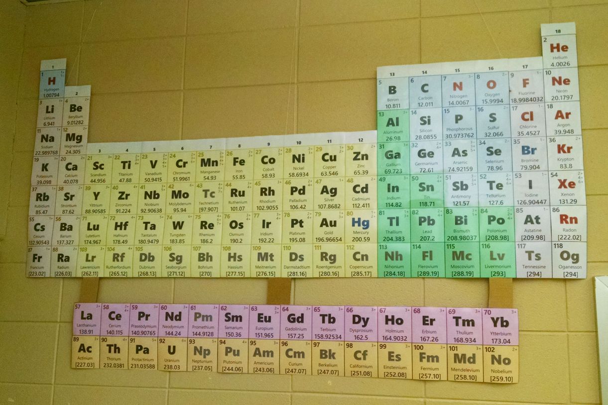
I’ve produced a printable periodic table for posting on the wall in my classroom (updated April 2017). I thought other teachers might wish to do the same, so I’m making it available here.
This version is designed to be printed in color on 4×6 photo paper (I chose matte finish for less glare, but glossy might work too). I had mine printed at Amazon Prints for about $11.00, though many local or chain shops may have special deals that would allow you to get this printed pretty cheaply. Each individual element block is then taped together on the back or glued onto a backing material. The final dimensions are about 6 feet wide and 3-4 feet tall.
The periodic table features include:
Element name, symbol, atomic number, and atomic mass
Includes updated names and symbols adopted by IUPAC through 2016
Common ions for most elements
Color-coded background for element families/groups
Symbols in black (solid), blue (liquid), or red (gas) elements (at room temp.) Synthetic elements are in gray.
Group numbers above each column (1 – 18)
To print your own, here is a zip file of jpeg photos that you can upload or bring to your photo printer:
The source files used to produce the images are provided here should you want to make any adjustments. The element database is an excel file, which is used in combination with word’s mail merge capabilities.
Note: images were produced by first saving the merged word document as a PDF and then using ImageMagick command:
magick.exe -density 300 PT-4x6-Color-Merged.pdf[0-117]
-background white -alpha remove -resize 770x996 -gravity
center -extent 800x1200 element.jpg
Version 1.0
My previous classroom had a very large blank wall to accommodate a very large periodic table. This is how it looked in my classroom.
The data is mostly based on the information in the element data base downloaded from Central High School’s website in St. Paul, MN, with a few corrections and additions from Wikipedia.org and WebElements.com.
These files were used to produce the periodic table using MS Word’s mail merge capabilities. Should you like to change it to your liking, you can download these files and produce your own.
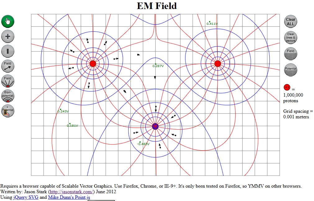
This summer, I’m at Arizona State University taking a modeling instruction workshop in physics – electricity and magnetism. In dealing with electric fields (vectors and lines), potential, and equipotential lines, the curriculum materials rely on EM Field software that hasn’t been updated in many years and is no longer available for purchase or download. The program is a 16-bit windows-95 era program and won’t even run anymore on Windows 7.
So, I set out to try to build a similar simulation with the same functionality online to make it available to other teachers.
Check it out and leave me your feedback about what works, what doesn’t work, and any suggestions for improvement.
The following student-exploration worksheet is based on Unit 1 – Worksheet 3a from the Modeling E&M materials, but I thought I would provide it here in case teachers wanted to use it. The directions are not very refined, but it is a start.


